Type
One typeface, Tacit Sans, with a Display cut for large titles, and Tacit Code for code. Eight sizes, three weights, and colour from four inks, never from opacity.
The scale
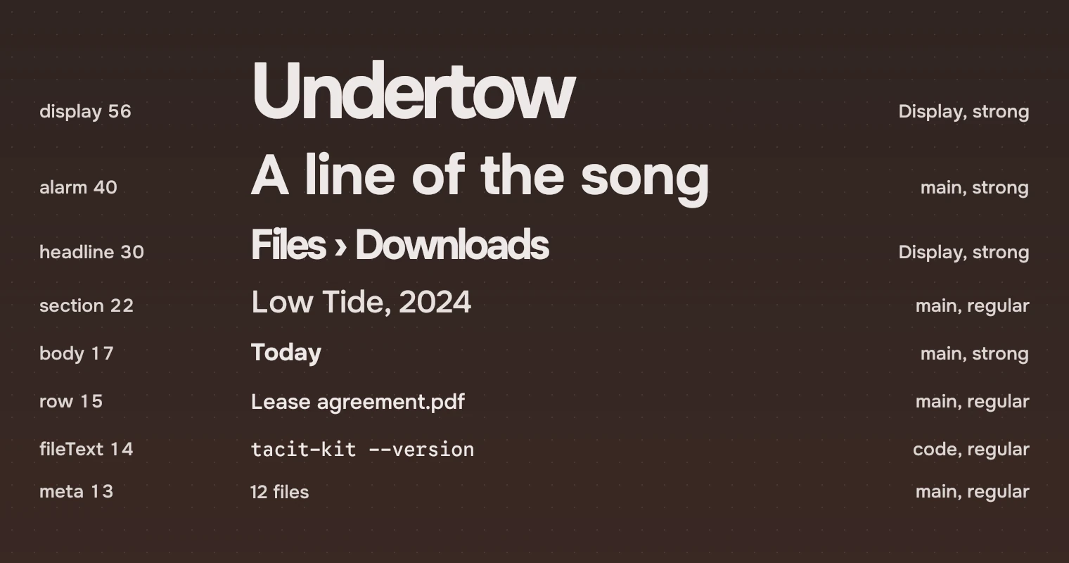
| Role | Size | Used for |
|---|---|---|
display | 56 | A stage subject: the song playing |
alarm | 40 | Big lines such as lyrics; a stage subject at half width |
headline | 30 | The page title, the path |
section | 22 | An album on an artist page, the line under a stage subject |
body | 17 | Section headings, rich row titles, the one sentence of an empty or failed page |
row | 15 | Row names and facts, actions, rail labels |
fileText | 14 | File text, in Tacit Code |
meta | 13 | Rail counts, the jump index |
Weights
Tacit Sans is a variable font on its weight axis. Ordinary text is 450, not 400. Medium (500) is for a row that is current or a rich row's title. Strong (600) is for headings and titles. The text page lists the weights with the cuts.
Cuts
Display is for one-line titles at 30 and above. Tacit Sans Display is drawn for large sizes and tight spacing: the page title, the stage subject. Running lines, lists and anything that wraps use the main cut. Figures in rows use the numbers cut: Tacit Sans with tabular digits, so a column lines up. File text and code use Tacit Code, a separate face. The four cuts are main, display, numbers and code.
Inks, not opacity
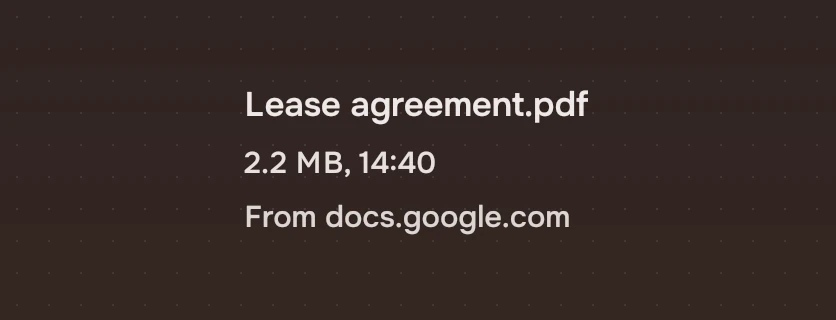
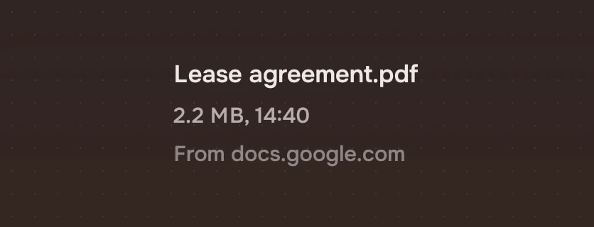
Text gets its level from an ink. Dimming a word with opacity lets the wallpaper into the letters, and the contrast then changes with the wallpaper. The four text inks keep an APCA contrast of 92, 85, 75 and 60 on every palette, and the hairline 16. Small text uses nothing below the meta ink, at 75. Colour lists them.
Rendering
Text is drawn natively without hinting. The kit's TacitText does this and sets the cut, size, weight and ink from names, so an app writes size: "body"; ink: "sec" and not a pixel size or a colour.
Experimental, in Tacit.Kit 0.1.
Text and figures: CC BY 4.0. Tacit.Kit: LGPL-3.0 code, OFL fonts. The Tacit name.