Principles
Seven rules that every Tacit app follows. Each is short enough to check against a screen.
One signal for each state
A state has one sign. Selection is a wash. Hover is a lighter wash. Pressed is a darker one. When a row is selected, it does not also get a bar, heavier words and a colour: three signs for one state read as three states, and the accent bar already means "you are here" in the rail.
Content first
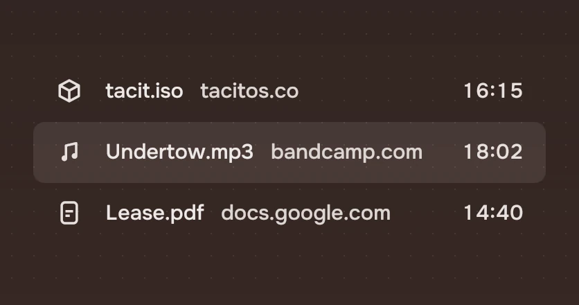
A file shows itself. A picture is a small picture, not a symbol of a picture in a box. A song shows its name. The window's own furniture, its rail and header, stays quiet so that what the person came for is the loudest thing on the page.
The path is the title
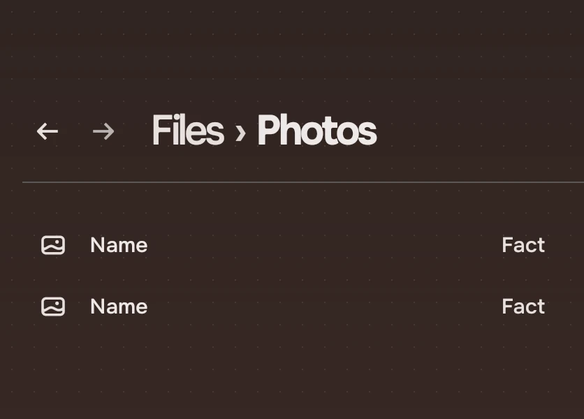
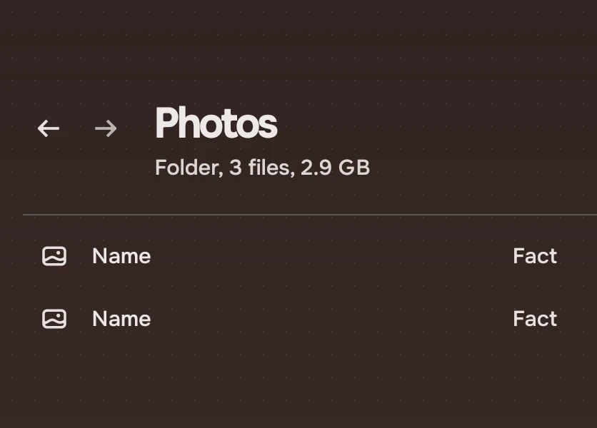
One level for each page. The title of a page is where you are: Files, then Downloads. The parents are in the secondary ink and press to go back. There is no subtitle under it; a count appears where it matters, as in "3 files, 2.9 GB" when you select three.
Nothing grows open under a passing pointer
The pointer points; it does not decide. A rail does not widen, a panel does not open and a list does not rearrange because the pointer went across it. Hover is a wash and nothing else. Things open when a person presses, or presses a key. A page also never opens, expands or rearranges itself because of playback or anything in the background: the accent only marks where the playing thing lives.
Large things land and stop
A big surface moves once, to its place. A panel arrives on a curve that decelerates hard and ends still; it leaves faster than it came. Bounce is for small, direct feedback, such as a switch knob, and never for a panel or a list. The keyboard is never behind: a selection that follows a held arrow key jumps, it does not glide. See Motion.
Words, not symbols, for actions
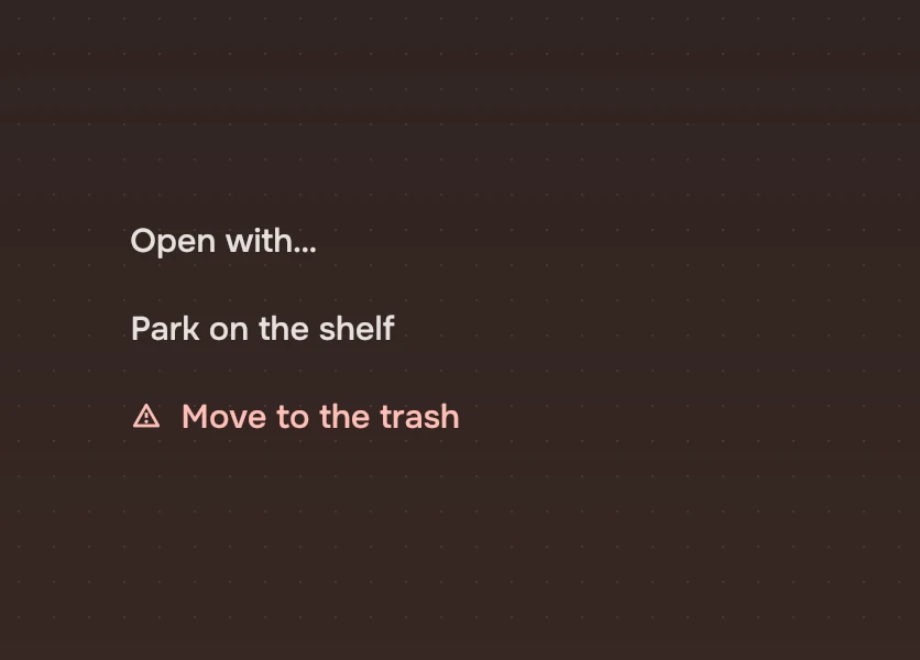
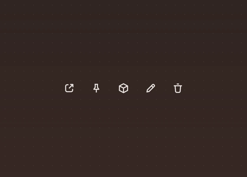
An action is a word. Symbols are for kinds of things (a song, a PDF) and for places (Home, Downloads). "Open with…" and "Move to the trash" are words, 40 pixels high, and the destructive one goes last with the warning symbol, so a risk is never said by colour alone. The few icon buttons (back, forward, close) have names for screen readers, and a tip where the symbol is not plain.
Each fact said once
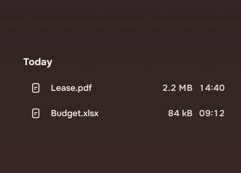
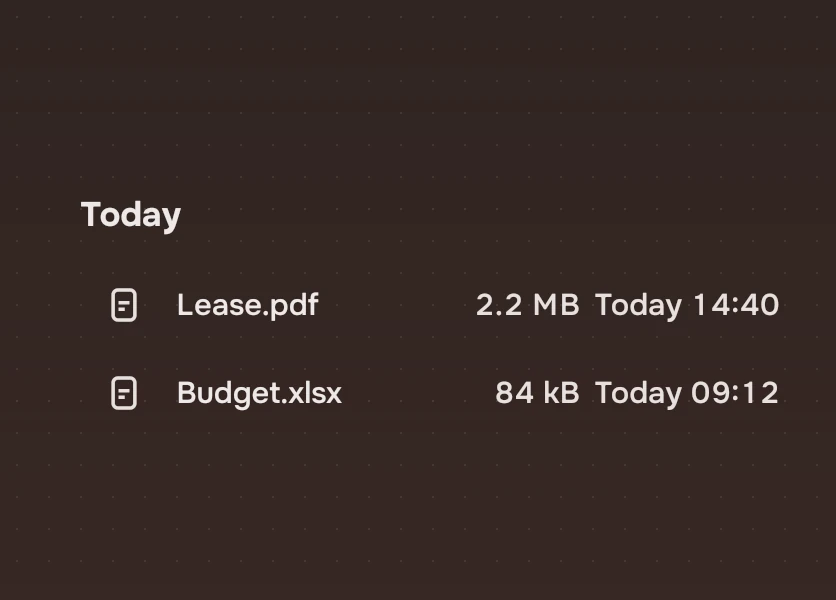
Say it where it belongs and nowhere else. The day is the heading, so the rows say only the time. The kind of file is the symbol, so there is no badge saying "PDF". A reason for a failure is said once, in the place a person is looking, and the row keeps only its symbol.
Experimental, in Tacit.Kit 0.1.
Text and figures: CC BY 4.0. Tacit.Kit: LGPL-3.0 code, OFL fonts. The Tacit name.